Header Title
From Grand Designs to weak design
Kathryn Tyler – an unusually capable designer forced to settle for mediocre communication, in a typical designer’s conundrum
Special skills highlighted
One Sunday I was revelling in end-to-end re-runs of Kevin McCloud’s Grand Designs series, featuring some of Britain’s most ambitious self-build projects, with intrepid individuals ploughing through the design and construction of their dream homes, often via nightmare processes.
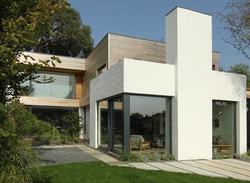
The one that caught my attention was a house in Cornwall designed and project-managed by a young but resolutely capable interior designer, Kathryn Tyler. She was portrayed as distinctive for her quiet, modest professional competence as well as her remarkable determination and attention to detail – her skills were “special” and Kevin McCloud seemed to be virtually drooling. The capability that apparently set her apart was the way in which she applied her unique design/architecture skills. My curiosity piqued, I went to her website. I was intrigued to see how a designer seemingly remarkable for her overall attitude and laid-back, gentle way of expressing it would present her uniqueness and her skills in the over-crowded designer marketplace. If communicated well, this subtly self-effacing lady could probably be a rising star in the architectural firmament.
From exceptional back to ordinary
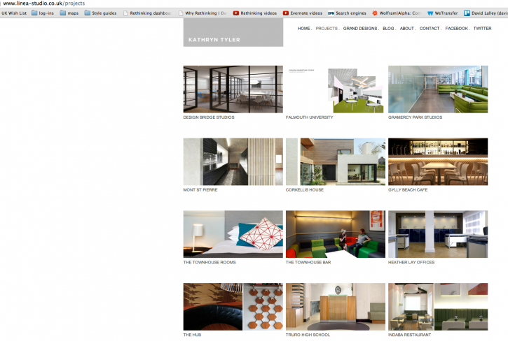
 Great was my disappointment when I discovered that Ms Tyler’s communication of her capabilities just subsided gently into mainstream sameness. As with so many designers/architects, it seems like the only obvious way to explain and describe her skills lies in pictures of the end result. Product, not process, resulting in the choice between suppliers being rolled back to just a question of apparent taste.
In one fell swoop, Kathryn Tyler had been relegated from an exceptional professional that a client might actively want to engage back to a one-in-a-thousand mediocrity, pretty much indistinguishable from the creative herd.
Product, not process – the designer disappointment
The focus on mere outcome rather than experienced process means the client can really only choose between different designers/architects on the basis of the end result – an altogether tougher playing field. Two designers/architects might easily produce a pretty similar product, but via two processes that the client could experience as radically different, in terms of costs, mental comfort or burdens, and overall customer experience.
By just following the norm and posting end-result pictures and standard portfolio boasts in order to communicate their capabilities, creative professionals unwittingly shift pretty much the whole burden of pre-contact research and choice over to the potential client, who is already busy with navigating treacherous and uncertain waters in pursuit of an elusive dream. With no idea of what the collaboration/client process will be like, the person with the money to spend is shooting in the dark. Not an ideal start to a client relationship …
A historical conundrum
The architect-client relationship is an often-fraught story and a bone of contention that has existed for millennia. And visuals have played a role in the language of discussion for just as long. Back in 2015, there was a beguiling exhibition about this at the wonderful Sir John Soane’s Museum at Lincoln’s Inn Fields in London. Drawings and models from the museum’s collection were used to explore how architectural visualisation has been an issue for centuries, and has played a key role in convincing clients, massaging reputations and launching new styles throughout history.
Isn’t it about time we applied the new tools now available to us to do something better?

